Websites, Apps, and Microwave Ovens; An Exercise in Unnecessary Complexity

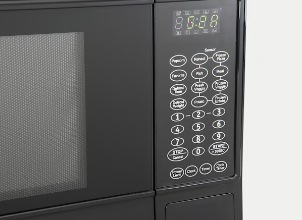
Like most everyone else, I barely remember life without a microwave oven. The first one I owned had a dial with a timer that started the microwave as soon as I turned it. Now, microwaves are feature-rich with special buttons for defrosting meat, left overs, popcorn, and potatoes. I even saw one with a button for “roasted chicken.” Who’s using that!?
I want two buttons. That’s it.
Really, if I could redesign my microwave, I just want two buttons. One that starts and adds time in 30-second increments and a stop/clear button. And, while this may not be enough for everyone, these two functions accomplish all I need as a user. I assume this would be easier to produce and maintain for the manufacturers. It would be easier for me, that’s for sure.
But, microwaves have been around long enough now to suffer from feature-creep. It’s an easy go-to to differentiate yourself from the competition, even if no one asked for it.
Maximum Viable Product: the other MVP
If you’ve spent any time developing websites or software, you’re more than familiar with feature-creep. If you’re a client who has needed those products built, you’ve probably caused feature-creep. RFP’s are some of the worst sources for it. Everyone involved gets to add their pet feature to the list whether it solves a problem or not. Though, the same thing can happen to internal teams too. It can be tempting to keep adding functions and features to the point that you end up with more of a “maximum” viable product rather than a “minimum” one.

Define what it doesn’t do
A slightly unusual approach involves actually defining what your product will not do, rather than what it should do. This isn’t necessarily a list of functions, but more a documentation of “negative objectives.” Someone building an app that tracks personal exercise activity might define calorie consumption as a negative objective. Meaning, they don’t want to make that part of the app experience. So, everyone involves knows not to recommend a function connected to that activity. Or, a website focused on publishing might decide they don’t want to publish articles in multiple categories. That would then preclude a host of functions involved with sorting and filtering content for users and site admins. In short, defining what not to do can be just as helpful as keeping the list of needed features short.
Even if you don’t release a bare essentials version, the process of defining those bare essentials can help you recognize which features have the most value, which ones are most responsible for revenue generation. These features should focus the flow of the central activity. It ensures everyone is aware of the functions that always propel the user forward with their tasks.
And to be fair, I’m really talking to clients rather than the professionals actually building the products. As clients and product owners it’s easy to get worried that your interactive product doesn’t “do” enough. A real MVP should accomplish uncomfortably little, but accomplish it with a great user flow and consistency.
Also, get rid of the “Roasted Chicken” feature you were considering. Nobody wants that anyway.